
High Tide Nails
Brand Redesign / Digital
Adobe Illustrator / InDesign
2025
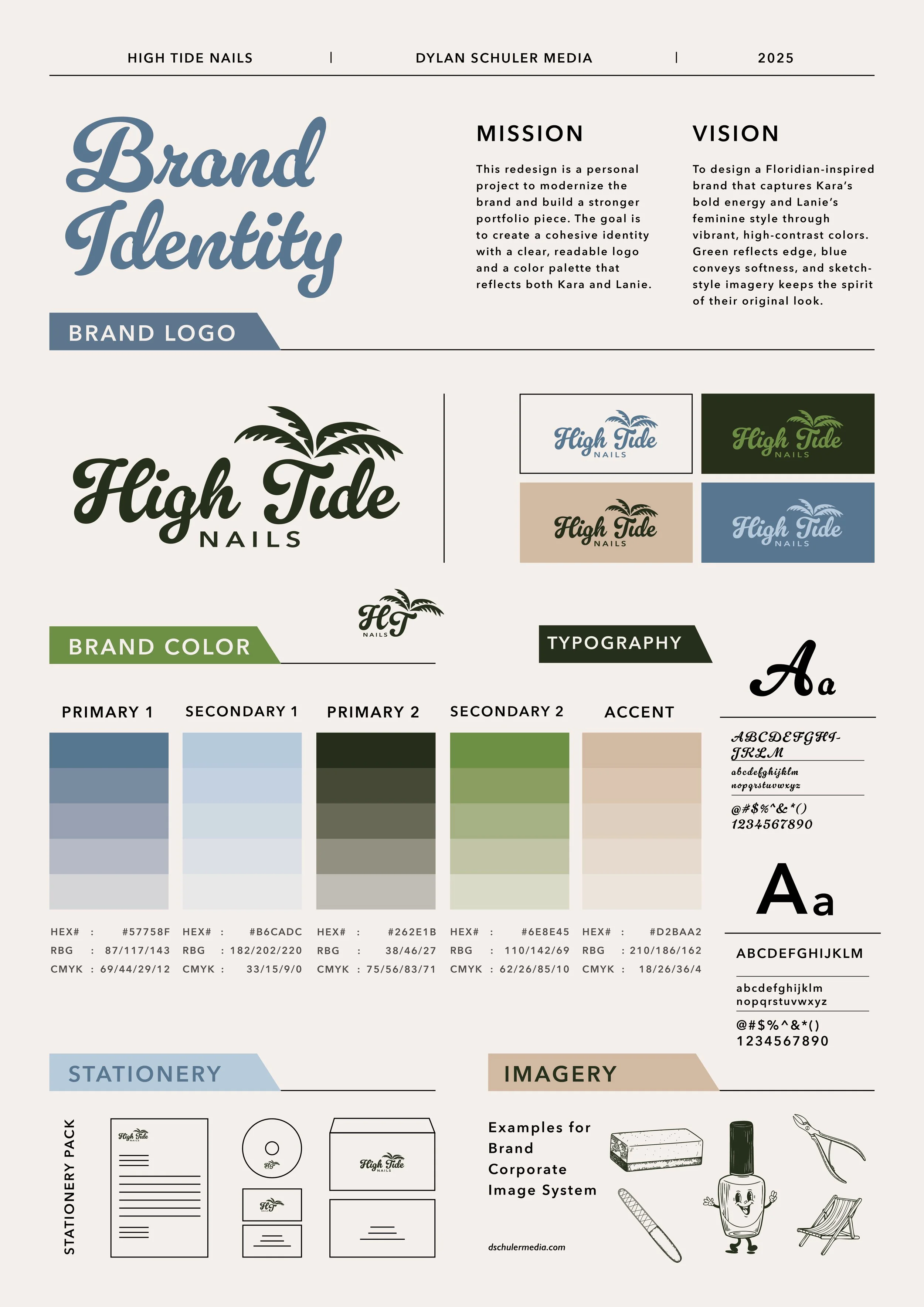
This redesign is a personal project to modernize the brand and build a stronger portfolio piece. The goal is to create a cohesive identity with a clear, readable logo and a color palette that reflects both owners, Kara and Lanie.
The Vision
To design a Floridian-inspired brand that captures Kara’s bold energy and Lanie’s feminine style through vibrant, high-contrast colors. Green reflects edge, blue conveys softness, and sketch-style imagery keeps the spirit of their original look.

Sketching Out Ideas
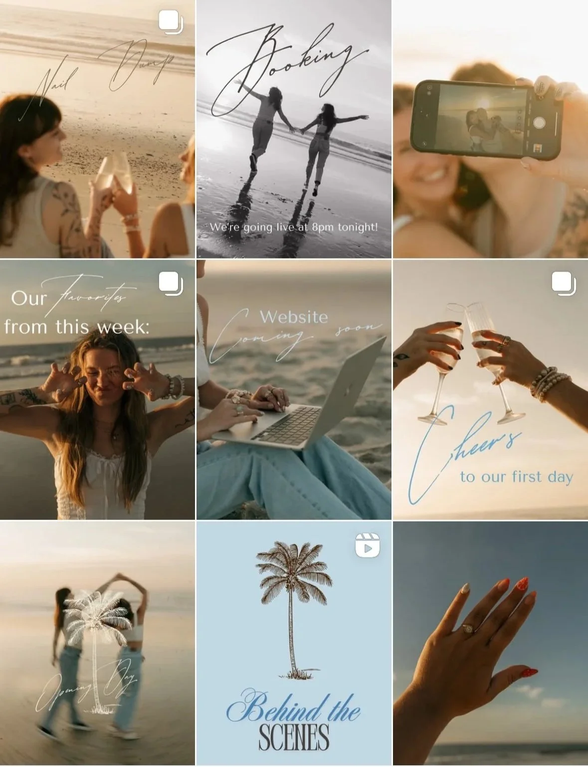
My sketches usually start as loose ideas, but this project inspired me to focus more on developing my iconography. I created a set of digital sticker concepts that could complement their scrapbook-style Instagram feed and add a fun, personalized touch to their brand presence.

Typography
What inspired me most in this redesign was their existing typography. It’s clear they love the expressive quality of script lettering, so I wanted to honor that while creating something bolder and more functional for a logo. Gelato Luxe strikes the perfect balance, confident and eye-catching while staying true to the character of their original style.

Color
Color plays a powerful role in defining a brand’s personality. For this redesign, I wanted the palette to reflect the balance between Lanie and Kara. Lanie carries a soft, light blue energy, while Kara feels grounded and vibrant like a forest green. Blending these with a neutral tone created a palette that feels simple, earthy, and subtly coastal. It took time to refine, but I’m very happy with how these colors complement each other.


Logo Design
It was important to create a logo that stayed true to the spirit of their original design. If this were a client project, maintaining familiar elements would help preserve their brand recognition. The palm tree and the inclusion of the word “nails” were key for clarity, so I transformed the “T” into a stylized palm tree to keep those details both functional and distinctive.


Building Identity
The business cards for High Tide Nails capture a coastal and welcoming atmosphere through soft, muted blues. A touch of vintage charm comes through in the striped design and the playful, illustrated nail polish bottle, creating a look that feels both nostalgic and fresh.

Digital Stamps
Creating custom visual elements was an important part of this process. High Tide’s Instagram has a scrapbook-inspired aesthetic, so I designed a series of stamp graphics that could be used as stickers, social media embellishments, t-shirt designs, and more. These elements help keep their branding playful, cohesive, and versatile.

Apparel Designs
Creating custom visual elements was an important part of this process. High Tide’s Instagram has a scrapbook-inspired aesthetic, so I designed a series of stamp graphics that could be used as stickers, social media embellishments, t-shirt designs, and more. These elements help keep their branding playful, cohesive, and versatile.


Apparel Tags
When designing a t-shirt, it’s important to go beyond the main graphic. To add more interest and a personal touch, I created specialized tags that bring a sense of sophistication and elevate the overall design, making the shirts feel fully branded.


Environmental Contact
Currently, their apparel line only features t-shirts. Expanding into items like tote bags or coffee mugs could elevate their brand presence and offer more variety. By keeping the designs playful yet subtle, customers will be drawn to the aesthetic rather than just the logo, making the merchandise feel stylish and desirable.
Branding Sheet
To introduce my designs, I created a client presentation that showcases the visuals in a clear and cohesive way. If this were a real client, this is what I would send as a preview of the proposed direction. Presenting designs in a format that feels intentional and visually engaging helps the client understand the vision and decide whether to move forward.