
Amelia Urgent Care
Experience Design / Digital
Adobe Illustrator & InDesign
2025
The objective of this project was to evaluate the design of a real-world environment, such as a library, medical office, or post office. This evaluation included analyzing the layout, poster and logo design, as well as the overall signage system to determine how effectively they support user navigation and experience. The goal was to identify strengths and areas for improvement in both functionality and visual communication. Additionally, we were tasked with designing a digital tool to help guide visitors through the space more efficiently. This tool aimed to enhance wayfinding by providing clear directions and relevant information, improving the overall visitor experience.
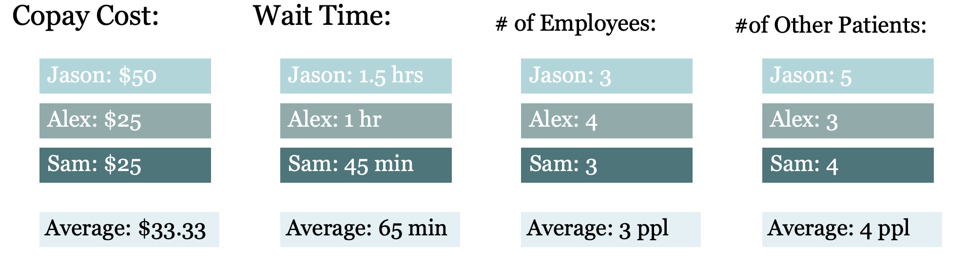
Patients often experience frustration due to long wait times, commonly caused by staffing shortages. Crowded lobbies and overwhelmed front desk staff can reduce service quality and empathy, leaving patients dissatisfied and less likely to return. Improving staffing levels and office workflow is essential to shorten wait times, enhance patient experience, and maintain trust in care.
The Dilemma

>

>

>
Repurposing Space
The Amelia Island Urgent Care waiting room and front desk are functional but could be improved. The waiting area currently seats eleven patients with awkward seating and brochure placement. My redesign expands seating to fourteen, relocates the brochure table for easier access, and distributes magazines across side tables to create a more welcoming environment. The curved front desk combines reception and office space, resulting in poor storage and organization. Separating these areas will provide dedicated workspaces, improved storage solutions, and privacy for the doctor, enhancing overall workflow and efficiency.
The exam rooms are well-equipped and efficiently arranged, with essential features such as exam tables, cabinets, sinks, and waste bins. This layout requires no modification. Additionally, a scale positioned in the hallway maximizes the use of previously unused space and will remain unchanged in the redesign.
HEX#: A9D6DB
CMYK: 32/3/13/0
RBG: 169/214/219
HEX#: E1F0F3
CMYK: 11/1/3/0
RBG: 225/240/243
HEX#: C43538
CMYK: 16/93/83/5
RBG: 196/53/56
Color
For this redesign, I chose to maintain the original color palette, which I find visually appealing, but applied it with greater intentionality. Red is reserved for highlighting important information, black is used for body text, and blue serves as an accent for secondary details or background elements. This approach ensures clarity and cohesion.

Typography
The font choice, Georgia, was deliberate due to its elegance and readability, as well as its nostalgic appeal, which resonates well with the community’s predominantly elderly population.

Personas
To design an effective digital element, it was important to first identify and visualize the target consumers. I began by analyzing the local demographic, which includes young African American men, middle-aged white women, and elderly men. Addressing the needs and preferences of these diverse groups is essential to creating an inclusive and impactful design.

Poster Upgrades
Developing new poster designs was a crucial part of the brand’s necessary upgrade. The existing posters neither effectively communicated the brand identity nor facilitated a smoother patient experience. Implementing a mobile check-in system streamlines the process by reducing the receptionist’s workload, allowing them to concentrate on tasks such as managing insurance, handling phone calls, and other essential duties.

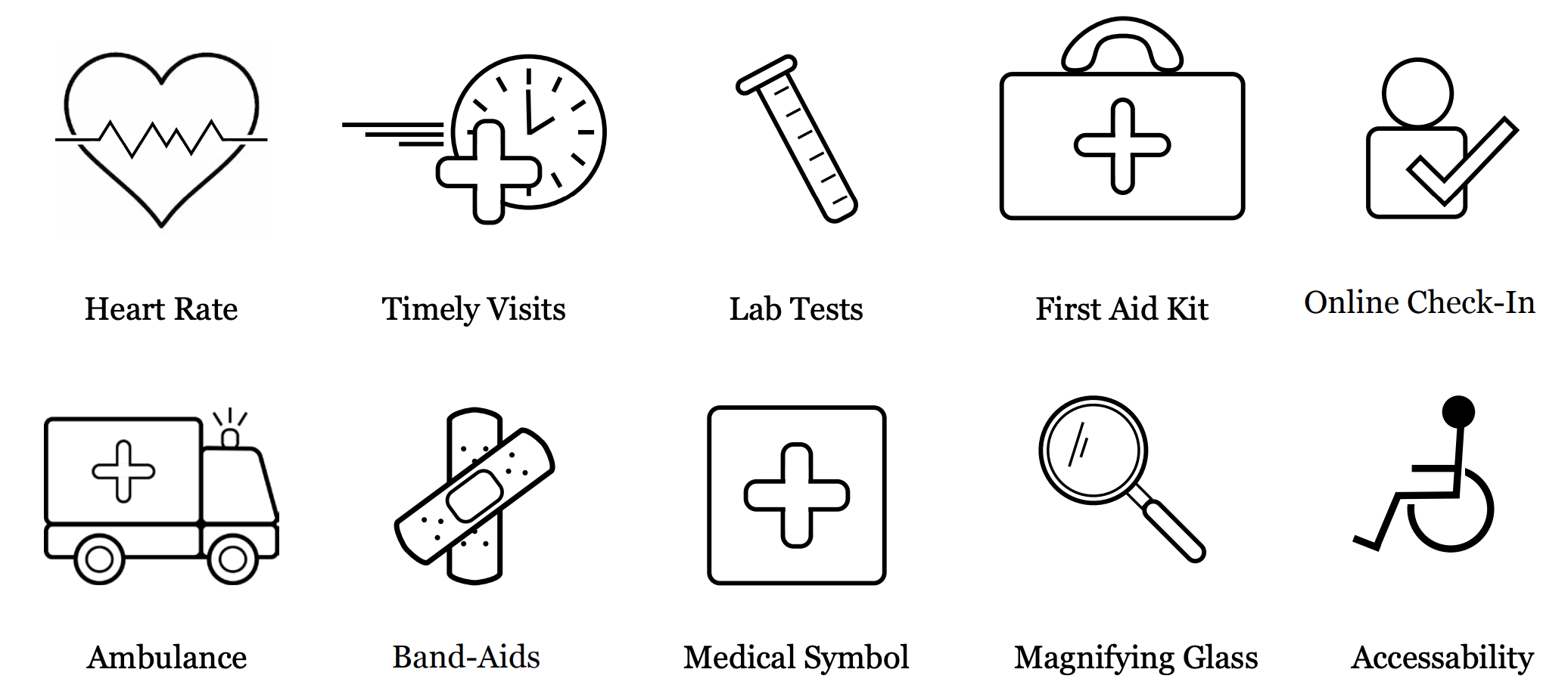
Amelia Urgent App
To reduce wait times, the Amelia Island Urgent App is designed to address patient questions before they arrive. It offers features such as online check-in, an educational information hub, and emergency contacts, providing a comprehensive resource for patients. Promoting the app through flyers is crucial for raising awareness and encouraging adoption. Effective marketing is crucial for guiding patients through new procedures, informing them of where to go, what forms to complete, and who to see. This app consolidates all of these elements into one convenient solution.