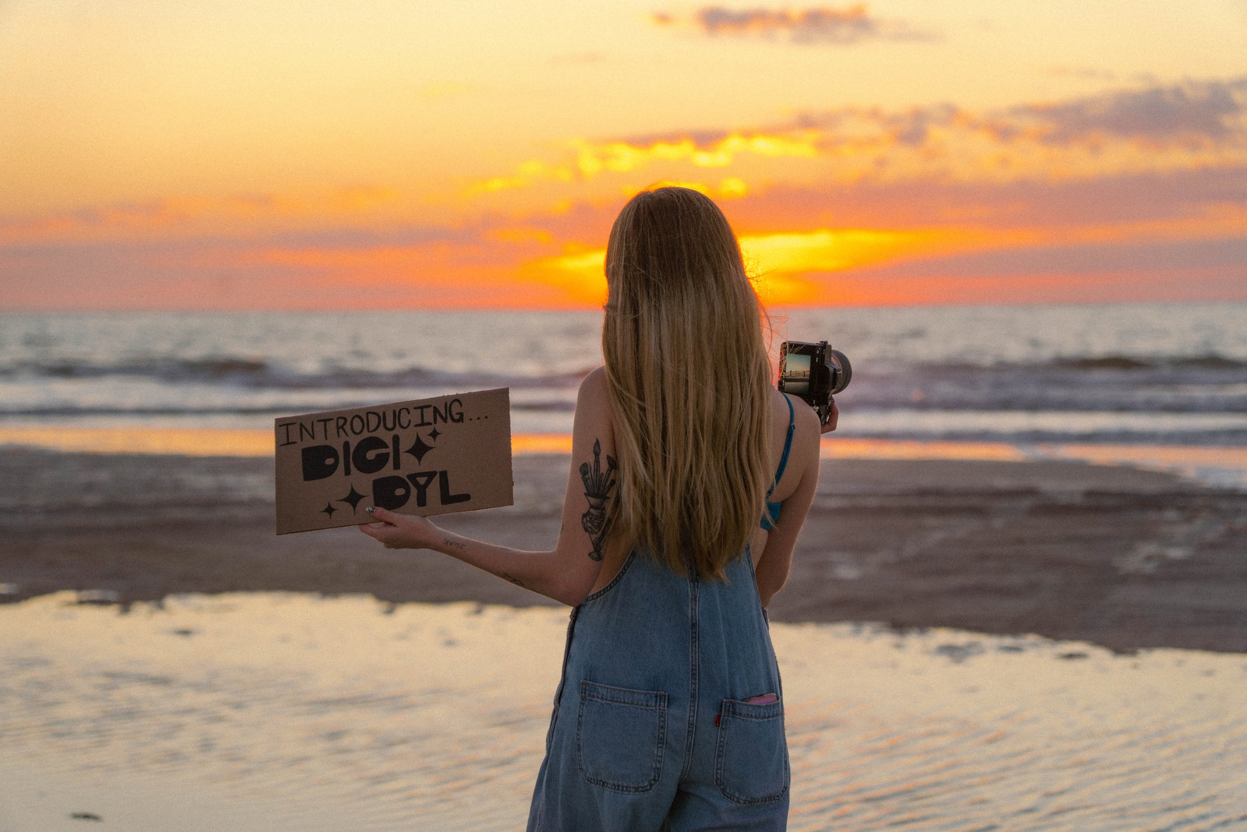
DigiDyl

Brand Design / Digital

Adobe Illustrator / Photoshop / InDesign

2026

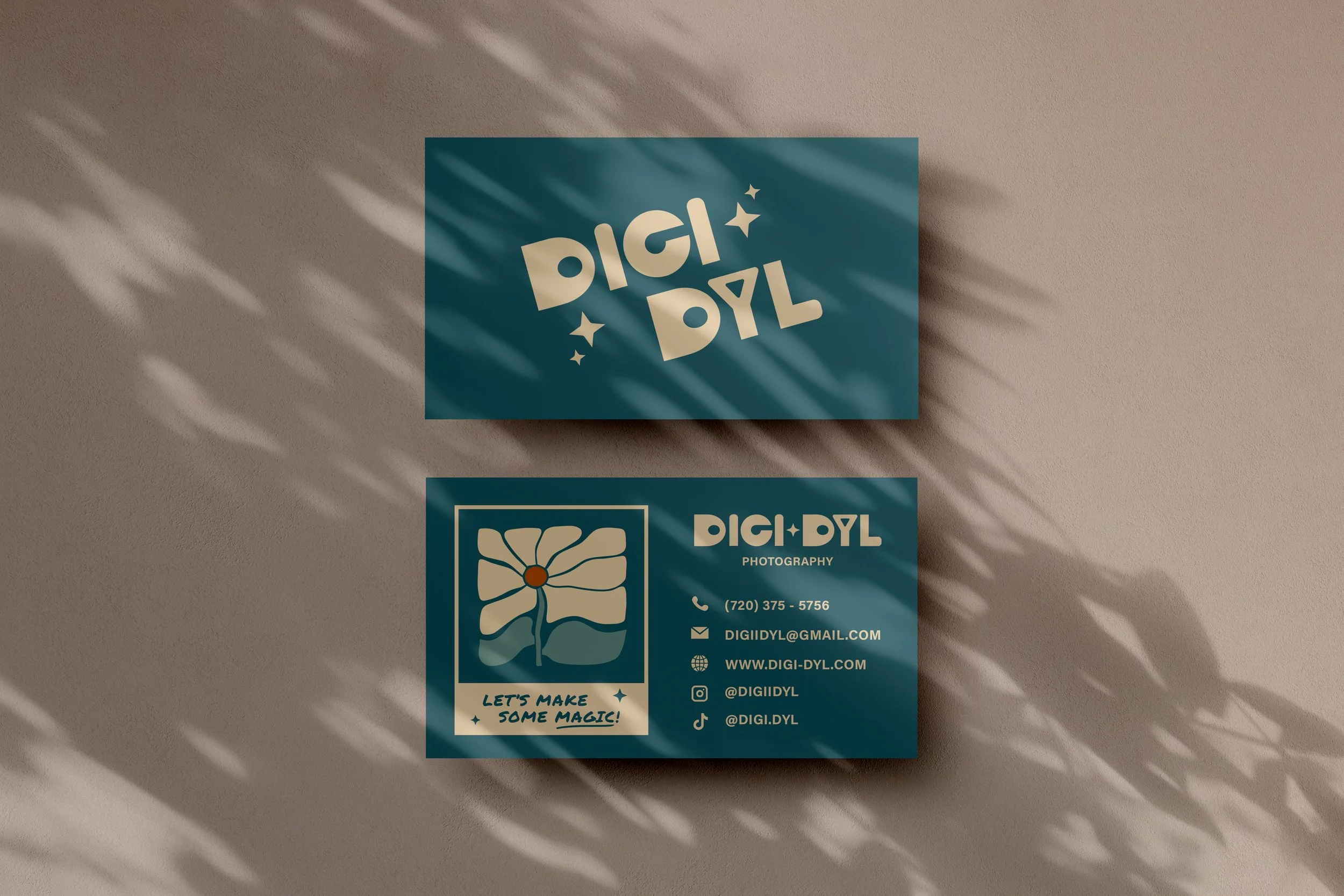
Designing my own branding was both exciting and challenging. Creating for yourself can be the hardest brief, but I’m proud of how it came together. I wanted an identity that truly feels like me and stands apart from other photographers.
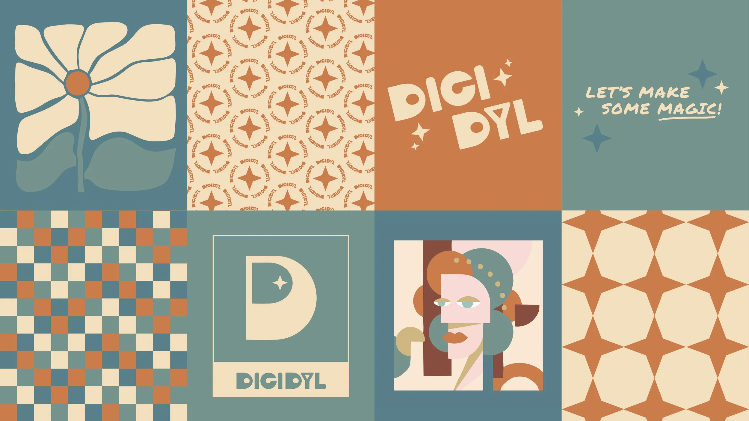
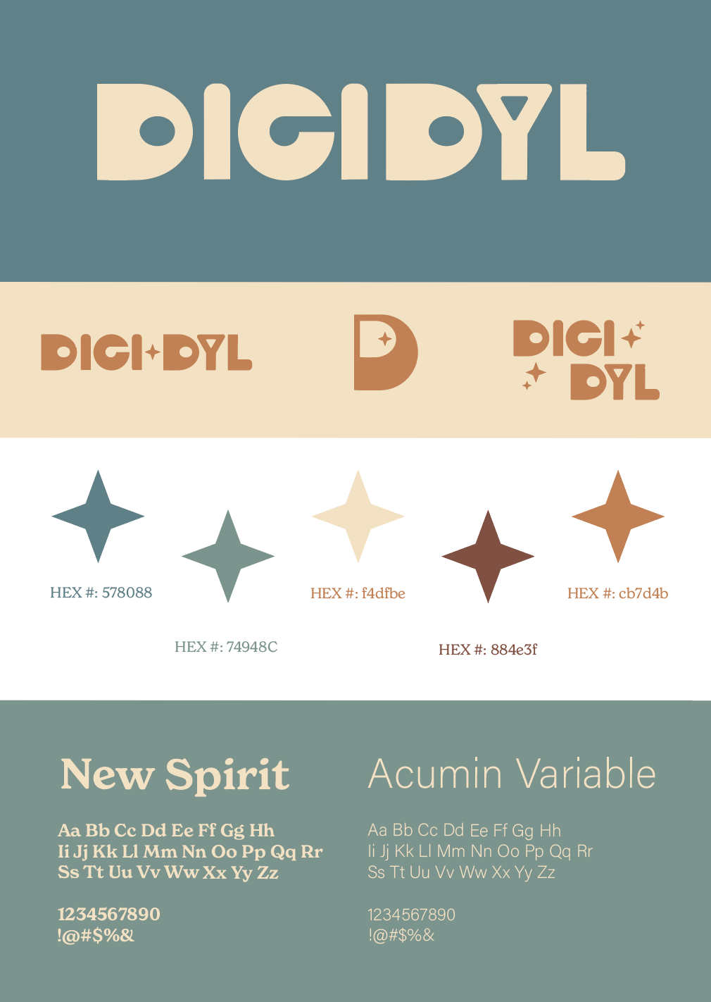
The Vision

When developing my photography branding, I start by defining the mood I want to create. Every detail, including the brand shoot itself, should reflect that vision. This stage allowed me to clarify my color palette, overall vibe, and creative direction for the session. (Photos from Pinterest)

Typography

Choosing typefaces that truly represented me was a challenge. Nothing felt quite right at first, so I spent time experimenting with different combinations until one finally clicked. The final pairing feels funky yet readable, modern with a subtle vintage edge. I was so excited about it that I immediately carried it over to my business cards.

Color

Color is always my favorite part of the process because it’s what truly brings a design to life. I wanted a palette that felt timeless, earthy, vintage, and still full of personality. Inspired by the beach, sand, water, and sun, I built a foundation that feels warm and natural, then incorporated brown as a nod to my Colorado roots and the mountains that shaped me. The final palette feels personal, cohesive, and aligned with the way I approach my work.

Logo Design

I’ve always loved vintage-inspired logos, so creating one for myself felt natural. I wanted something chunky, rounded, and full of personality. The result is a distinctive mark that stands out in an oversaturated photography market. From there, I developed multiple variations to support different marketing needs and applications.

Building Identity

When designing my business cards, I decided to turn them into loyalty cards to make them more meaningful. Each session earns a punch, and no session is too small to count. I will also be counting sessions from the past year toward a reward as a thank you to my returning clients. It encourages continued collaboration while giving clients something tangible to take home at the end of each session, almost like a gift card that represents both our work together and what’s still to come.

Client Connection

Simplicity guided this design. I wanted it to feel fun and visually engaging while still maintaining a clean, professional aesthetic. You will not see a traditional camera icon, and that is intentional. Instead of following the expected, I chose a minimal polaroid outline to keep the look modern and distinctive. “Let’s make some magic!” is more than a tagline. It is an invitation for clients to collaborate, imagine freely, and create something meaningful together.

Alternative Logos

Having alternative logo variations is both strategic and essential. The full logo isn’t always the right fit, which is why a compact mark and stacked option are included. These variations ensure my brand stays consistent, flexible, and effective across every application.

Environmental Contact

Showcasing these designs in real life is an essential part of my process. It allows me to see what truly works and what needs refinement, whether that is text that feels too small or imagery with too much detail. Viewing the designs in a matte, printed format also helps me understand how the colors translate beyond the glossy look of my software, giving me a more accurate sense of the final result.

Branding Sheet

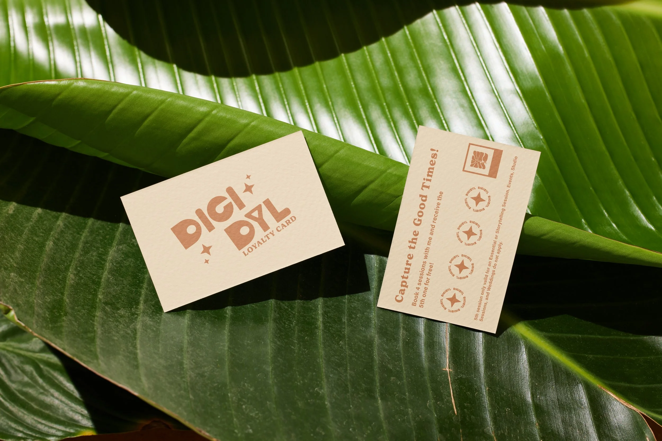
Creating a branding sheet provides me with a clear, comprehensive overview of my identity. It outlines the color palette, typography, logo variations, and illustrations in one cohesive layout. Presenting everything together helps guide how and where each element should be used for consistent brand application.
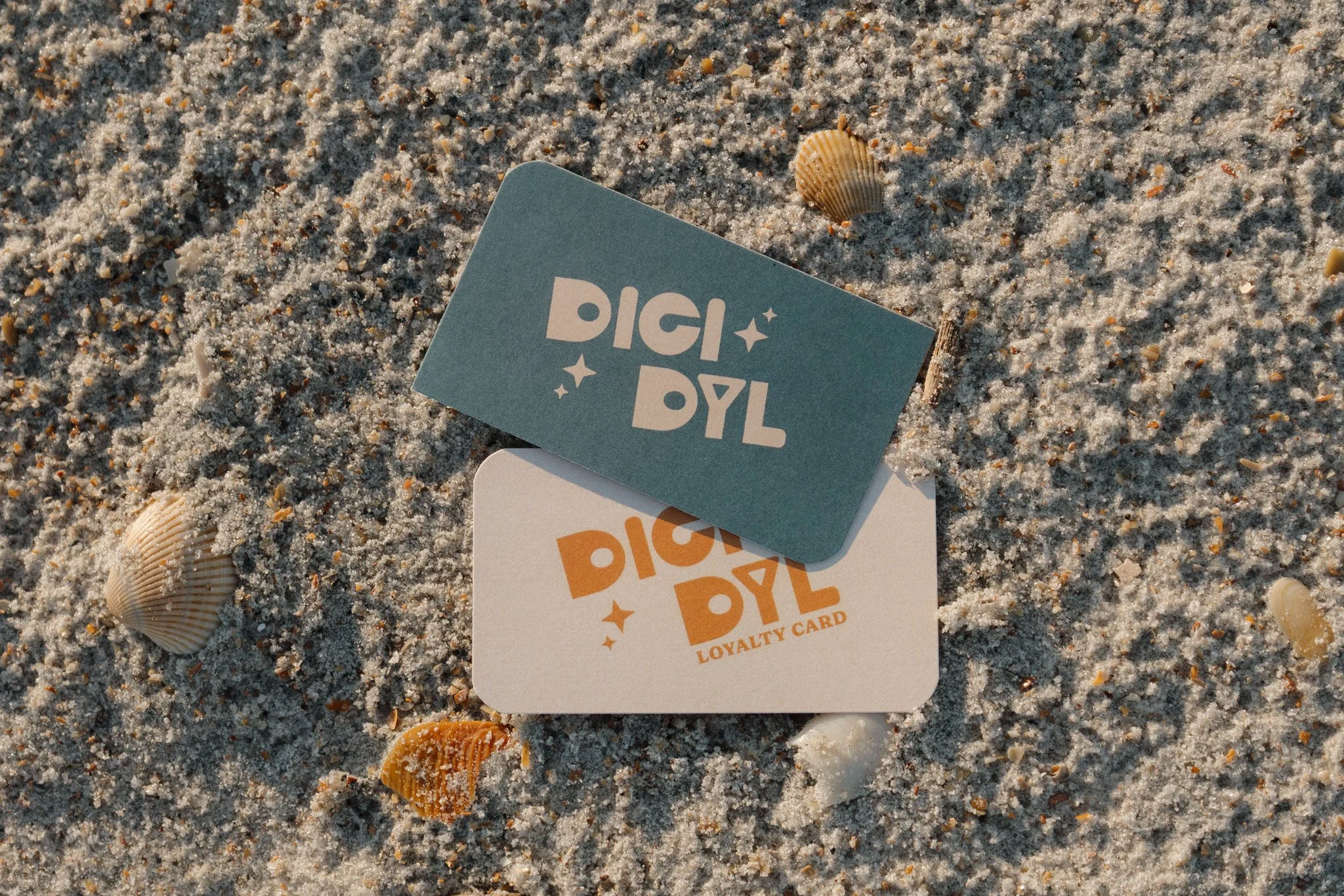