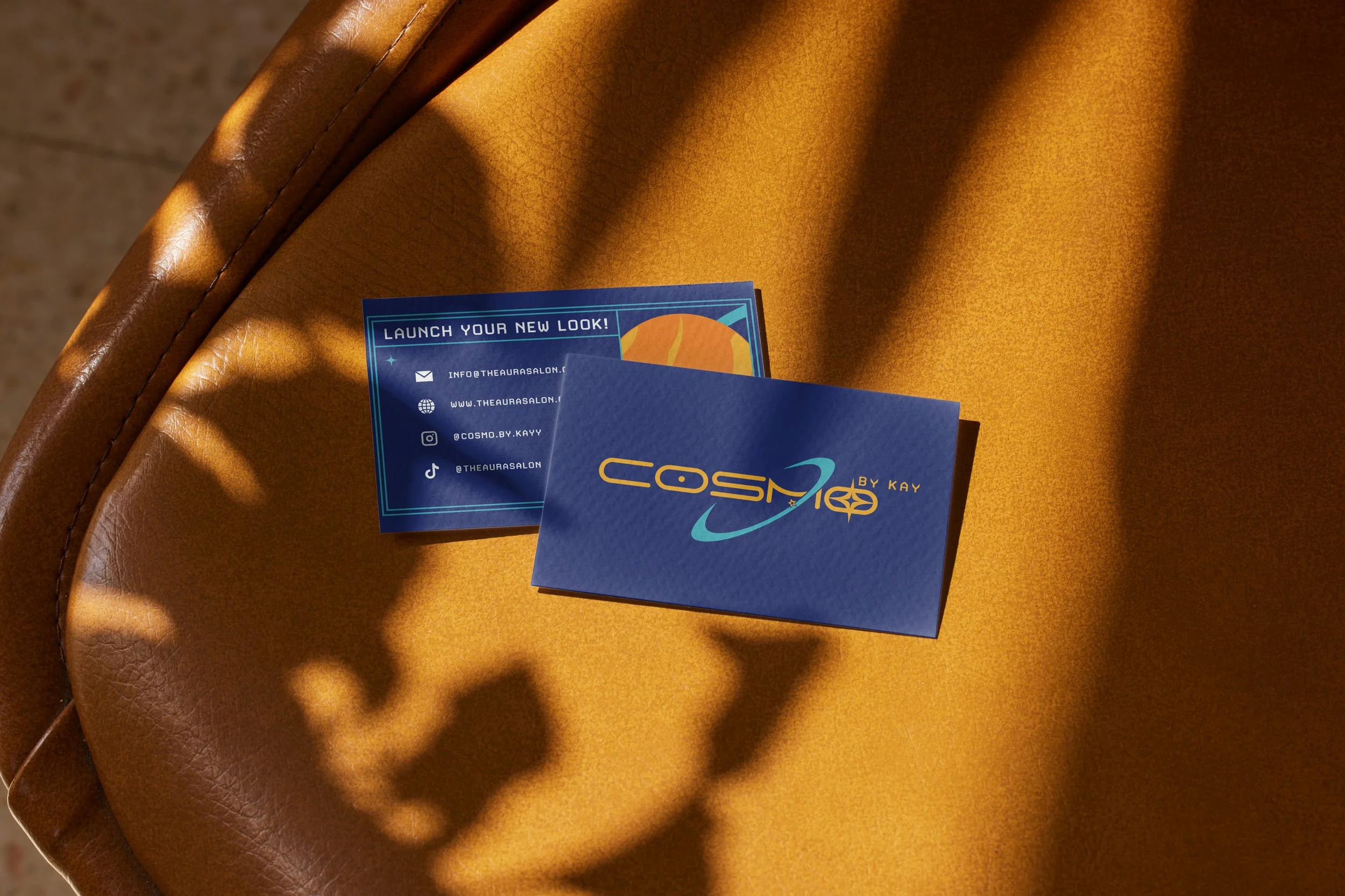
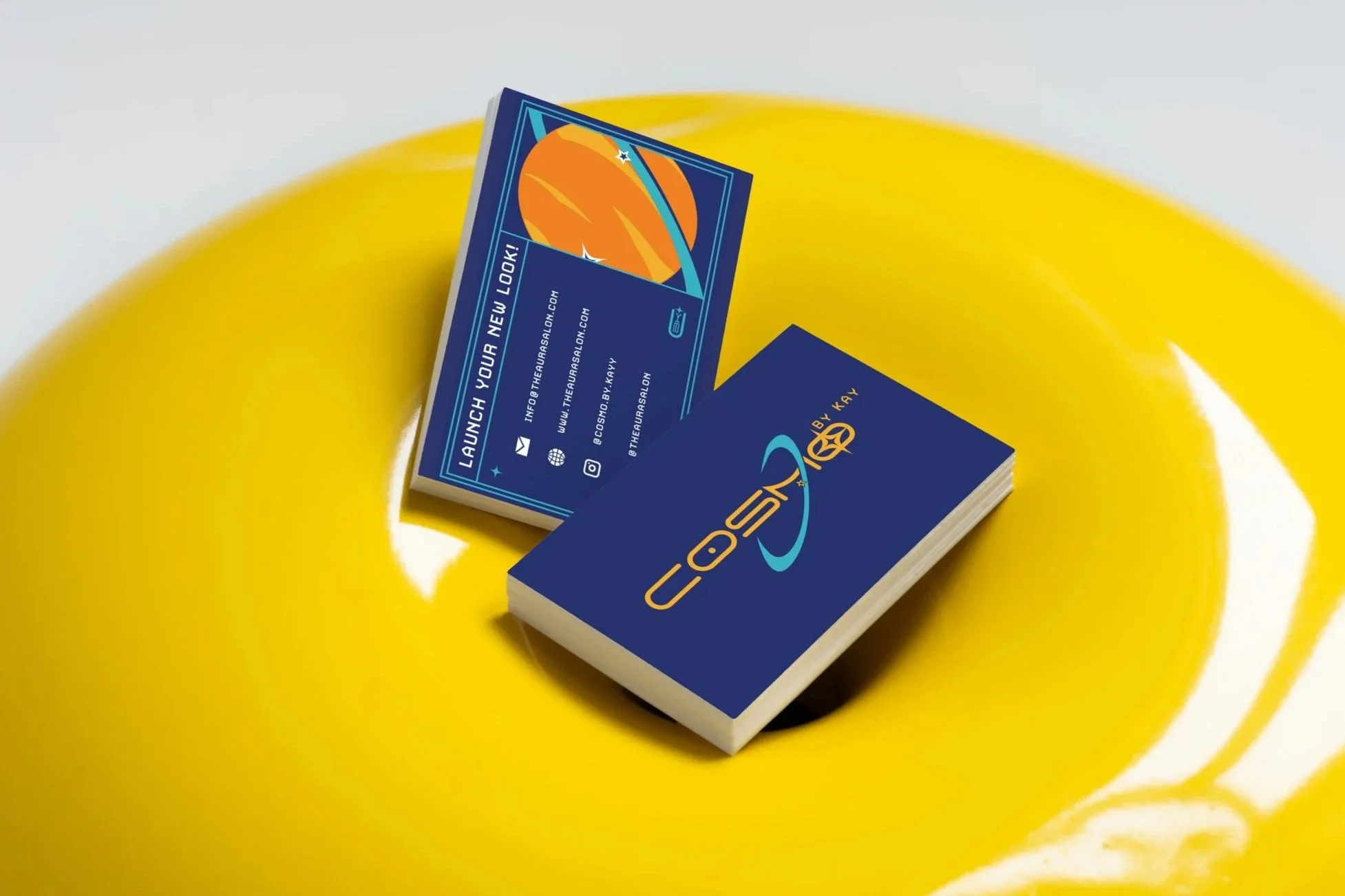
Cosmo by Kay
Brand Design / Digital
Adobe Illustrator / Photoshop / InDesign
2026
Designing for Cosmo by Kay was about creating a bold, personality-driven identity from the ground up. Inspired by a nostalgic cartoon aesthetic, the final brand feels playful, distinctive, and instantly recognizable.
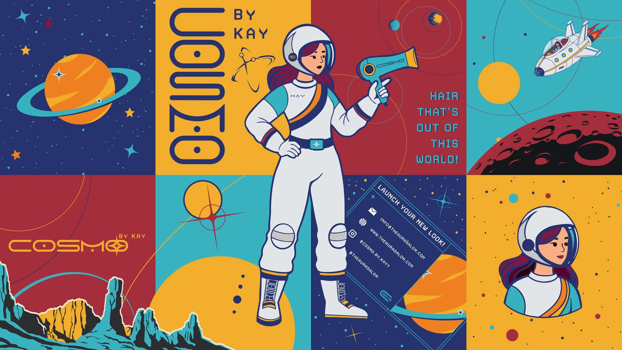
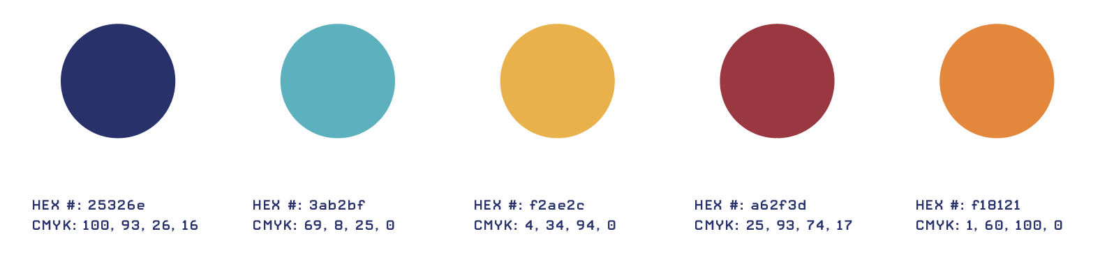
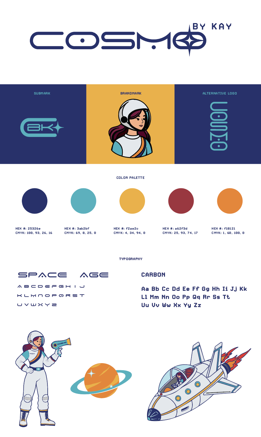
The Vision
While developing the moodboard for this project, I was especially drawn to the bold optimism of 60s futurism. That inspiration shaped the typographic direction, leading me to explore forms that felt playful yet strong. The final logo is bold, funky, and designed to be instantly memorable. (Photos from Pinterest)
Typography
Finding the right type pairing for Space Age was a process. After exploring countless combinations, I landed on a pairing that truly captured the 60s-inspired vision. Space Age brings the retro futurism, while Carbon reintroduces a subtle techno edge. Together, they create a dynamic foundation with plenty of room for creative exploration.
Color
The color palette for this design is intentionally diverse to keep the brand versatile and eye-catching. Since hairstylists market themselves year-round, having multiple color variations allows the logo to adapt while still grabbing attention. The range of tones also adds depth and dimension to the overall design system.
Logo Design
This design balances a futuristic feel with a retro influence inspired by my 60s space moodboard. “Cosmo” takes center stage to highlight the service itself, while Kay’s name is intentionally secondary. Kay is the stylist, and Cosmo represents the craft.
Building Identity
Business cards don’t have to feel ordinary. For this design, I leaned fully into the space theme, creating a layout inspired by a spaceship control screen that displays all essential information in a clear, engaging way. The themed call to action adds personality while still guiding the viewer. After refining the spacing and layout, the final result balances fun, clarity, and strong visual impact.
Alternative Logos
Having alternative logo variations is both strategic and essential. The full logo isn’t always the right fit, which is why a compact mark and vertical option are included. These variations ensure the brand stays consistent, flexible, and effective across every application.
Illustrations
Creating a character for Kay felt essential to the brand. She’s guiding clients through a transformation, much like an astronaut embarking on a journey into space. The character adds personality, strengthens the storytelling, and creates endless opportunities for marketing and connection.
Environmental Contact
Because Kay works within a salon and doesn’t sell her own product line, strong personal branding is especially important. Business cards help her establish recognition and build her own client base. Seeing them produced brings the vision full circle and makes the identity feel tangible and real.
Branding Sheet
Creating a branding sheet provides the client with a clear, comprehensive overview of their identity. It outlines the color palette, typography, logo variations, and illustrations in one cohesive layout. Presenting everything together helps guide how and where each element should be used for consistent brand application.