Curology Travel Essentials
Brand Extension / Digital
Adobe Illustrator, InDesign, and Photoshop
2024
The objective of this project was to develop a brand extension for Curology. Through thorough research, I identified an opportunity for the company to expand its offerings. Curology is a skincare brand focused primarily on acne treatment, prioritizing healthy skin over trends or elaborate packaging. This essential daily care is needed in all aspects of life, whether on vacation, business trips, or casual visits with friends. Recognizing the universal demand for convenience, I aimed to introduce travel-sized products to bring Curology into the travel market, addressing a practical need for customers on the go.

To gain a comprehensive understanding of Curology and its products, I began with in-depth research. Creating a mind map proved invaluable for organizing my ideas and identifying key areas for development. This process allowed me to pinpoint gaps in their offerings, with the travel kit emerging as a clear opportunity for brand expansion and the foundation for my project.
Brainstorming

When developing my sketches, I placed the highest priority on the imagery. In previous projects, my designs often leaned heavily on text, so this series became an opportunity to shift my focus toward visual storytelling. My goal was to encapsulate each emotion within a single, representative object, allowing the imagery to carry the narrative. While nostalgia required additional brainstorming beyond the initial sketches, this process helped me refine my vision, clarify my creative direction, and, most importantly, ensure that each element would work together as part of a cohesive and unified piece.
Sketching Out Ideas
HEX#: 25203D
CMYK: 87/86/46/53
RGB: 37/32/61
Color
When it came to selecting a color, the choice was largely predetermined by Curology’s strict brand guidelines. Their color palette is consistent and rarely deviates, if at all. For this reason, I aimed to keep my design fully cohesive with their established branding and the rest of their product line.
Typography
Keeping with the established theme, selecting a typeface for this project was straightforward. I opted for Arial, as it closely aligns with Curology’s curated font, offering a clean, professional look that complements their current product design and brand identity.

Graphic
Curology’s minimalist packaging design provided a strong foundation, allowing me to create a clean, simple graphic while thoughtfully incorporating color to enhance the overall aesthetic.


Packaging
While designing the box, I soon realized that focusing on just three sides was sufficient to create a cohesive and impactful design. Each side needed to be simple, dynamic, and thoughtfully aligned with how the brain processes visual information. Staying true to Curology’s branding, my goal was to ensure the box seamlessly integrated with their existing product line, maintaining the clean, minimalist aesthetic that defines the brand.


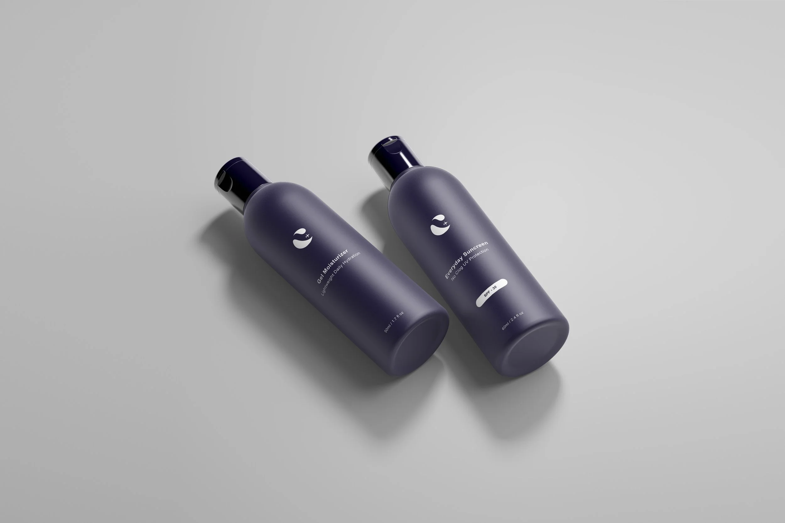
Bottled Up
Designing these bottles was straightforward; my approach was to emulate the existing packaging to ensure strong brand alignment. The designs would be printed directly onto the bottle. For this project, I focused on maintaining consistency with Curology’s established aesthetic, intentionally setting aside personal creative preferences to produce designs that not only align with the brand but also meet professional standards I’m proud of.

Environmental Contact
Finalizing these designs was an enjoyable and rewarding process. This project reinforced the idea that sometimes less is more, with simplicity serving as the key to effective design. Seeing the complete package presented in a mockup helped unify all the elements and created a cohesive, engaging visual experience.

